- QATestLab Blog >
- Mobile Testing >
- Kids Apps UI/UX requirements
Modern technologies offer unique opportunities for kids to obtain new knowledge and skills. But it is much harder to attract children’s attention than the adults’ one. If you want kids to love your app and launch it once and once again, app UI and UX design should be simple and exciting. How to achieve that? Let’s try to find out in a new blog article.
Many people think that writing a book for children is a piece of birthday cake. A simple storyline, simple characters, a lot of funny jokes, and you have managed it. But in life, it is more difficult than it might seem. You should consider the psychology of children and things that distinguish them from adults.
Mobile apps for kids are like books for kids. If you want to create an application for teaching or relaxation for kids, you need to stay a child yourself!
UI principles of design apps for kids are various, and though these are parents who install applications, you first need to develop a product for children.
Designing Mobile Apps: Differences between kids and adults
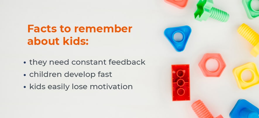
There are three significant characteristics of kids you should remember when it comes to mobile app design:

- Children need constant feedback on every action they take.
- Kids develop fast.
- They easily lose motivation.
Consider these differences when developing an app and follow a bunch of useful advice.
Basic rules for kids apps design
We have analyzed the experience of our clients who produce software for kids and share the rules they follow while doing this:
More challenges
Challenges are extremely important when it comes to children’s applications. Kids love trials everywhere. They make their achievements more significant. Even if you are designing a relaxing app for kids, add more challenges in your applications, and you will get more participation of children.
If a child makes a mistake using the educational application, do not show the solution immediately. Instead, give a hint of what is wrong and let the child figure it out. It is important to let the children make mistakes … and correct them.
More feedback
By playing in the digital space, children expect to receive visual feedback during interaction with the app. That is why most children’s applications generate some kind of feedback for each interaction.
Give a purpose
Your application should have a goal, and its goal should be obvious from the very beginning, both for adults and for children. Although it’s easy to believe that children will just love to explore your application, they will quickly get bored if there is no use of it.
Define the age range
Finally, remember that children grow very fast. This explains these narrow age groups for which children’s applications are oriented: the ages of 3-4, 5-6, etc. This is because children are constantly developing, and an application focused on a three-year-old child, will not work for a five-year-old. A good strategy is to choose a maximum two-year age range.
Tips to follow while designing kids applications
Besides, here are some fundamental things you should consider when developing mobile apps for children:
- Be very careful when using in-app purchases as a monetization strategy. If it’s too easy to pay something in your application, it will probably push parents away. Children will not understand that they pay for things with the money of their parents.
- Do not place interactive elements at the bottom of the screen, as children tend to accidentally touch this area.
- Use bright colors.
- Provide many features, not a script. Children are researchers by nature, so don’t make a single scenario of using your app. This tip applies to games and educational applications.
Last word on requirements for design of apps for children
Though design for kids is challenging, at the same time, the process brings a lot of fun. Knowing the peculiarities and needs of your target audience is a step towards the success of the application of any type. Proper quality assurance is another step. QATestLab team is always ready to help you with UI, functional, and compatibility testing of your app, and make suggestions on UI/UX design. We provide a full range of QA services and can help your app achieve success on the market.
Learn more from QATestLab
Related Posts:
- Automation Testing for Mobile Apps: Why It’s Essential and Our Key Services
- How One Bug Can Wreck Your Reputation — And How QA Prevents It
- Testing on Real Devices — Just an Option or a Necessity?
About Article Author
view more articles
has more than 2-year experience in blogging and copywriting, copyediting and proofreading of web content.
View More Articles


