Everything You Should Know About Accessibility Testing
by Yana Bozhko | August 18, 2021 8:11 am
The most famous and bright example of why content accessibility testing should be done happened with the popular anime Pokemon: over 685 victims.

So, on December 16, 1997, all the children of Japan were eagerly sitting in front of the TV screen and waiting for the anime to begin. That episode was viewed in over 26.9 million homes that day. According to the plot, Pikachu uses “Lightning Strike” and an explosion occurs. It was accompanied by a change of two contrasting colors – red and blue at a frequency of 12 hertz. As a result, 685 people (mostly children) across Japan were taken by ambulance with various symptoms: headache, dizziness, seizures, nausea. Later, about 12,000 more children complained about similar symptoms (most of which were refuted and associated with mass hysteria).
It was found that the cause of the seizures was the so-called photosensitive epilepsy, which was triggered by bright color flashes.
As a result:
- Pokemon anime show was suspended for 4 months
- Nintendo’s share price fell by 12,620 yen
- The case appeared in the Guinness book of records 2000 as the “Most harmful TV show”
And since then, several new rules for creating custom content have appeared.
For example:
- the frequency of flashing of the image, especially for red images, should not exceed three times per second;
- flashing images should not be displayed for more than two seconds;
- stripes, spirals, and concentric circles should not be allowed to occupy most of the screen.
Contrast and blinking frequency are still checked at one of the Accessibility Testing stages.
Why does a business need accessibility?
2022 will see a jump of the companies investing in accessibility testing to improve their customer experience. Information technologies have become an integral part of our life, and making them available to as many people as possible is a must.
Accessibility Testing is defined as a type of Software Testing performed to ensure that the site, application, or operating system being tested is usable by people with disabilities like hearing, color blindness, old age, and other disadvantaged groups. It is a subset of Usability Testing[1].
At the moment, more than one billion people (15% of the total population) are people with disabilities or special needs.
About 8% of men and 0.4% of women suffer from various types of color blindness – not so little! Of course, this is not a disability, but unusual color perception can significantly interfere with the perception of information and create a number of difficulties, for example, when driving a car or making online purchases. As a result, many solutions from online stores to games are losing users because of ignoring the improvement and testing their accessibility.
Analytical studies show that available sites combined with good design have a larger audience and better results in search engine rankings. They work well with SEO because they are usually fast and easy to use. And this is already a business component.
Another reason is that companies with inclusive sites are increasing their profits. For example, the world-famous retailer Tesco has made its website accessible in 2019. And it helped to increase profits by 13 million pounds. As it turned out, everyone loved easy navigation and easy access, not just users with special needs.
To which users of your product it may concern?
- Older people.
- People with visual impairment: blindness, poor eyesight, color blindness.
- People with hearing impairment: deafness, hearing loss.
- People with speech disorders.
- People with mental disorders: difficulties with the perception of new information, inability to focus on a large amount of information.
- People with nervous system disorders: headache, dizziness, disorientation, temporary blindness and manifestations of epilepsy, associated with difficulties in perceiving the frequency and contrast of images.
- People with limited fine motor skills and musculoskeletal system functioning impairments: limited ability to use a mouse, slow reaction.
- Various combinations of other impairments.
How can we understand what requirements must be met?
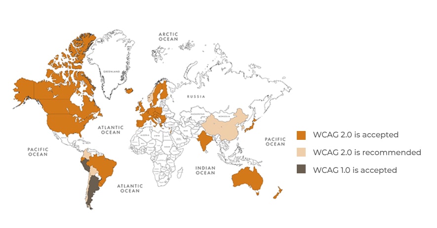
There is no need to reinvent a wheel. Сontent accessibility legislation with a certain level of standards[2] (WCAG) has been officially adopted in 25 countries.
WCAG at a glance

The WCAG standard is divided into four key sections:
- Perceivable
- Operable
- Understandable
- Robust
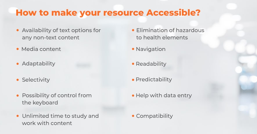
How to make your resource Accessible?
To make sure that your site is comfortable, simple, and accessible for all users, you need to go through this checklist:

- Availability of text options for any non-text content
People with disabilities will be able to receive non-textual information using alternative means, such as Braille or speech.
- Media content
Presenting information through sign language will greatly facilitate the understanding of the content for people with hearing impairments.
- Adaptability
Content should not lose its meaning when presented in different forms. It should be remembered that sometimes the meaning of the information can change with the change in the sequence of the arrangement of the content. Therefore, it is important to set the required order of information blocks in advance.
For example, text-to-speech software interprets an HTML page as a sequence of text, rather than a collection of blocks of information. Therefore, the order of such blocks should be strictly observed in the source code of the page.
- Selectivity
It is necessary to facilitate the perception of content as much as possible by separating the main and secondary parts.
For example, you can make the content easier to view by increasing the text size to 200%.
And if there are banners with voice acting on the page, it is worth giving the user the opportunity to mute the sound on the current page.
- Possibility of control from the keyboard
In this case, it is important that all basic actions on the page can be performed using the keyboard. Especially when it comes to fairly popular one-page sites today.
- Unlimited time to study and work with content
For example, the user has the ability to re-authorize and at the same time completely save all the entered data.
- Elimination of hazardous to health elements
Do not use items that flash constantly or flash more than 3 times per 1 second.. This can adversely affect the health of users.
- Navigation
Navigation should help the user navigate the application. For example, having several ways to find the desired page will simplify and speed up your work.
- Readability
For example, this can include decoding abbreviations or using a tool that allows you to listen to the pronunciation of words when it is decisive in understanding the meaning.
- Predictability
It will be easier for the user to navigate if the order of the navigation elements on the page group is the same.
- Help with data entry
It will be easier for people with disabilities to enter information if they receive prompts in a timely manner in case of incorrect spelling of words.
- Compatibility
The content must be fully compatible with modern applications, including assistive technologies.
Examples of such software are:
- Speech Recognition Anywhere[3] – converts the spoken word to text, which serves as input to the computer.
- Dalton for Google Chrome[4] – software allowing people with different kinds of color blindness (color vision deficiency) to see more colors.
- Snap and Read Universal[5] – reads both accessible and inaccessible text aloud from websites, Flash websites, images, Google Docs, eBook Readers, Kindle Cloud Reader, email, PDFs, web-based tests, and more.
 [6]
[6]How to conduct accessibility testing?
To conduct this type of testing, first of all, it is needed to select points from the WCAG, which must be adhered while developing the application. The first step is testing for compliance with automatic tools and browser extensions such as Lighthouse[7], Wave[8], aXe[9], NoCoffee[10], ChromeLens[11]. Once checked, these tools will generate gross inconsistencies and recommendations for improvement.
But automatic tools can’t catch everything, so it is advisable to support them with auto manual testing.
Another way you need to test for accessibility is to use Screen Readers. These are applications that sound to the user what is happening on the screen. It’s hard enough to understand whether the voice acting will actually be produced correctly and available to users without those tools.
After testing, all found bugs and inconsistencies are sent to the bugfix and the attached recommendations for improvement.
What do we think about this?
Individuals who have disabilities are relying on digital services more than ever before for everyday activities (remote work, education, healthcare, banking, shopping, etc.). The accessibility implementation is a great addition to any site or application. And it is very pleasant to work, realizing that this can significantly facilitate someone’s life from the one side and receive more profit from another.
To stay around accessibility testing you can follow the next experts: Crystal Preston-Watson[12], Marie Drake[13], Aparna Gopalakrishnan[14], and Manoj Kumar[15].
To find out whether your solution corresponds to WCAG and is accessible for users, contact us[16] for help.
Learn more from QATestLab
Related Posts:
- Usability Testing: https://qatestlab.com/services/manual-testing/ux-usability-testing/
- Сontent accessibility legislation with a certain level of standards: https://www.w3.org/WAI/standards-guidelines/wcag/
- Speech Recognition Anywhere: https://chrome.google.com/webstore/detail/speech-recognition-anywhe/kdnnmhpmcakdilnofmllgcigkibjonof?
- Dalton for Google Chrome: https://chrome.google.com/webstore/detail/colorblind-dalton-for-goo/afcafnelafcgjinkaeohkalmfececool?
- Snap and Read Universal: https://chrome.google.com/webstore/detail/snapread-universal/mloajfnmjckfjbeeofcdaecbelnblden?
- [Image]: https://qatestlab.com/solutions/by-focus-area/web-application-testing/?utm_source=Blog&utm_medium=Post&utm_campaign=web-application-testing
- Lighthouse: https://chrome.google.com/webstore/detail/lighthouse/blipmdconlkpinefehnmjammfjpmpbjk?hl=ru
- Wave: https://chrome.google.com/webstore/detail/wave-evaluation-tool/jbbplnpkjmmeebjpijfedlgcdilocofh
- aXe: https://chrome.google.com/webstore/detail/axe-web-accessibility-tes/lhdoppojpmngadmnindnejefpokejbdd
- NoCoffee: https://uxpro.cc/toolbox/nocoffee/
- ChromeLens: https://chrome.google.com/webstore/detail/chromelens/idikgljglpfilbhaboonnpnnincjhjkd
- Crystal Preston-Watson: https://twitter.com/ScopicEngineer
- Marie Drake: https://twitter.com/mcruzdrake
- Aparna Gopalakrishnan: https://twitter.com/aparna2019
- Manoj Kumar: https://twitter.com/manoj9788
- contact us: https://qatestlab.com/company/contact-us/
- Automation, AI Testing, and Accessibility: Key Trends from VDS 2025: https://blog.qatestlab.com/2025/11/11/automation-ai-testing-and-accessibility-key-trends-from-vds-2025/
- The Importance of Accessibility Testing in Meeting EAA Standards: https://blog.qatestlab.com/2025/07/17/the-importance-of-accessibility-testing-in-meeting-eaa-standards/
- Accessibility Testing: Creating a World Without Walls: https://blog.qatestlab.com/2024/04/03/accessibility-testing-creating-a-world-without-walls/
Source URL: https://blog.qatestlab.com/2021/08/18/accessibility-testing/

