- QATestLab Blog >
- QA Basics >
- How to Test Responsive Design?
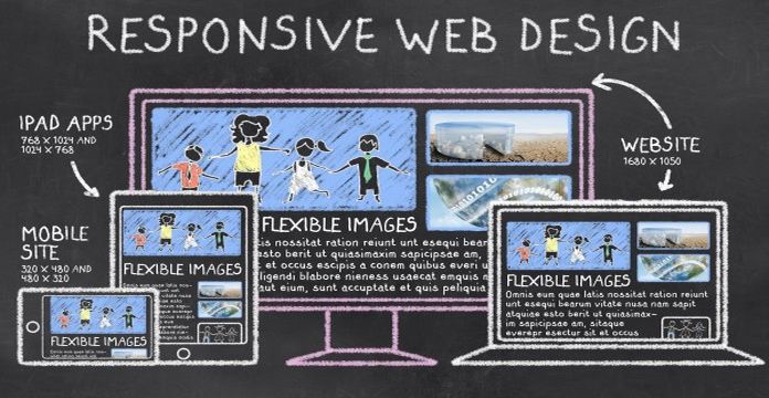
Nowadays a huge number of various devices are used for serving the Internet. They have different screen size and resolution, system capacities, etc. In order to improve the user’s experience of viewing diverse websites, the RWD (Responsive Web Design) approach was developed.
The main aim of RWD is to avoid or minimize scrolling and resizing of the page. It is possible due to flexible images, CSS3 media queries, fluid grid concept, etc. The point is that the page elements are resized more in personage, than in pixels.
To check the website with responsive design, the testers should conduct several types of software testing – desktop checking, mobile testing, and web control.
What Are the Difficulties of RWD Testing?
- The variety of platforms and devices. The quick visual check can be performed by changing the size of the browser window – it is the basic test. Usually, emulators-based testing is conducted but it will not provide the real results.
- During e-commerce testing, it is necessary to remember that the position of modules can be changed.
- In order to define the most popular OS and its version, as well as actual mobile device, the special analytics, for example, Google Analytics, can be used.
- To check the core functionality, it is possible to apply automated testing and checking on emulators but manual testing on real devices should also be performed. And during such checking, the word of different gestures should be tested too. For example, tapping, portrait or landscape modes, finger swipes, etc.
Learn more from QATestLab
Related Posts:
- Tools for Responsive Design Testing
- Navigating the Web: The Power of Cross-Browser Testing
- Web and Desktop Testing: Key Differences Between Them
Article "tagged" as:
Categories:


No Comments Yet!
You can be the one to start a conversation.